In the world of fashion, colour is a powerful language. It communicates emotion, creates illusion, and, when mastered, becomes the most potent tool in your personal style arsenal. Understanding colour theory is a fundamental skill that elevates the ordinary to the extraordinary. This guide will demystify the art of colour, helping you curate a wardrobe that is both cohesive and intrinsically you.
Understanding the Fundamentals of Colour Theory
Colour theory provides a framework for creating harmonious colour combinations, guiding everything from interior design to our daily fashion choices. For the discerning individual, it offers a method for building a wardrobe that is both visually appealing and deeply personal.
The Colour Wheel: Your Map to a Perfect Palette
The colour wheel is the foundation of all colour theory. It is an illustrative model that organises colours based on their relationships. Primary colours—red, yellow, and blue—form the base. From these, secondary colours (green, orange, purple) are mixed. Tertiary colours, such as blue-green or red-violet, are then created by mixing a primary and a secondary colour. Understanding this structure is the first step toward creating sophisticated colour pairings.
Hue, Saturation, and Value: The Three Pillars of Colour
Beyond the basic wheel, colour has three key dimensions:
- Hue: This is what we typically think of as colour (e.g., red, green, blue).
- Saturation: This refers to the intensity or purity of a colour. A highly saturated colour is vivid and bold, while a desaturated colour is more muted and subtle, often mixed with grey.
- Value: This is the lightness or darkness of a colour. Adding white creates a lighter value (a tint), while adding black creates a darker value (a shade).
Mastering the interplay of these three elements allows for nuanced and refined style choices that go far beyond simply matching your shoes to your handbag.
Determining Your Personal Colour Season
Seasonal colour analysis is one of the most effective ways to apply colour theory to personal style. This system categorises individual colouring into four "seasons"—Winter, Spring, Summer, and Autumn—each with a distinct palette of flattering hues.
The Four Seasons: Are You a Winter, Spring, Summer, or Autumn?
Each season is defined by two primary characteristics: the undertone of the skin (cool or warm) and the value and chroma of one's overall colouring (light/dark and bright/muted).
- Winter: Cool undertones, with deep, vivid, and high-contrast colouring. Think jewel tones like ruby red, emerald green, and sapphire blue.
- Spring: Warm undertones, with light, bright, and clear colouring. Think fresh, vibrant shades like peach, coral, and bright aqua.
- Summer: Cool undertones, with soft, muted, and gentle colouring. Think dusty pastels like rose, lavender, and powder blue.
- Autumn: Warm undertones, with deep, rich, and earthy colouring. Think warm, spicy shades like terracotta, mustard yellow, and olive green.
Identifying Your Undertones: The Key to Your Season
Determining your skin's undertone is the crucial first step. Look at the veins on the inside of your wrist in natural light. If they appear blue or purple, you likely have cool undertones (Winter or Summer). If they appear greenish, you have warm undertones (Spring or Autumn). This simple test unlocks the door to your most flattering colour palette.
Building Your Wardrobe with Colour Theory
Once you have identified your season, you can begin to build a wardrobe that truly harmonises with your natural colouring. This is not about restriction, but about informed selection.
Creating a Cohesive Colour Palette
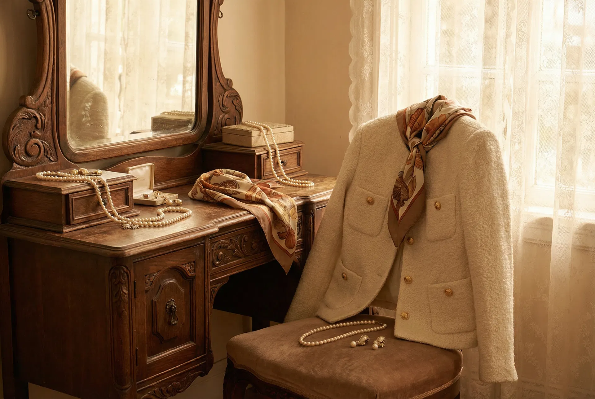
A well-curated wardrobe is built on a foundation of neutral colours from your seasonal palette, accented with brighter hues. For instance, an Autumn palette might be built on camel, cream, and chocolate brown, with accents of burnt orange and forest green. This approach ensures that every piece in your wardrobe can be mixed and matched with ease, a principle central to a well-executed capsule wardrobe.
Using Accent Colours to Make a Statement
Your accent colours are where you can truly express your personality. A pop of a complementary colour—the colour directly opposite your main shade on the colour wheel—can create a dynamic and eye-catching look. The psychology of how we perceive these colours can profoundly affect not just how others see us, but how we feel about ourselves, a concept explored in the psychology of fashion.
Advanced Colour Harmonies for the Style-Savvy
For those wishing to delve deeper, exploring classic colour harmonies can elevate your style to an art form. These are tried-and-tested combinations that create a sense of balance and visual appeal.
Monochromatic, Analogous, and Complementary Schemes
- Monochromatic: Using varying tints and shades of a single hue for a sophisticated, elongated look.
- Analogous: Combining colours that sit next to each other on the colour wheel, such as blue and green, for a serene and comfortable effect.
- Complementary: Pairing colours from opposite sides of the colour wheel, like blue and orange, for a vibrant, high-impact statement. This same principle of contrast is often used to create dimension in hair, such as in a balayage treatment.
Comparing Colour Analysis Methods
While the four-season model is a popular starting point, more nuanced systems exist for those who seek greater precision.
| Feature | 12-Season Analysis | Tonal Analysis | Flow Analysis |
|---|---|---|---|
| Core Principle | Expands on the four seasons by introducing 'flow' characteristics (e.g., 'Bright Winter', 'Soft Autumn'). | Focuses on the single most dominant aspect of your colouring (e.g., 'Deep', 'Light', 'Soft', 'Clear', 'Warm', or 'Cool'). | Acknowledges that an individual's colouring can have characteristics that 'flow' into an adjacent season. |
| Best For | Individuals who feel they sit between two of the four traditional seasons. | Pinpointing the most crucial element of your palette when you don't fit a single season perfectly. | People whose colouring appears to change, for instance with a summer tan or a change in hair colour. |
| Complexity | High | Medium | Medium |
Frequently Asked Questions (FAQ)
1. Can my colour season change over time?
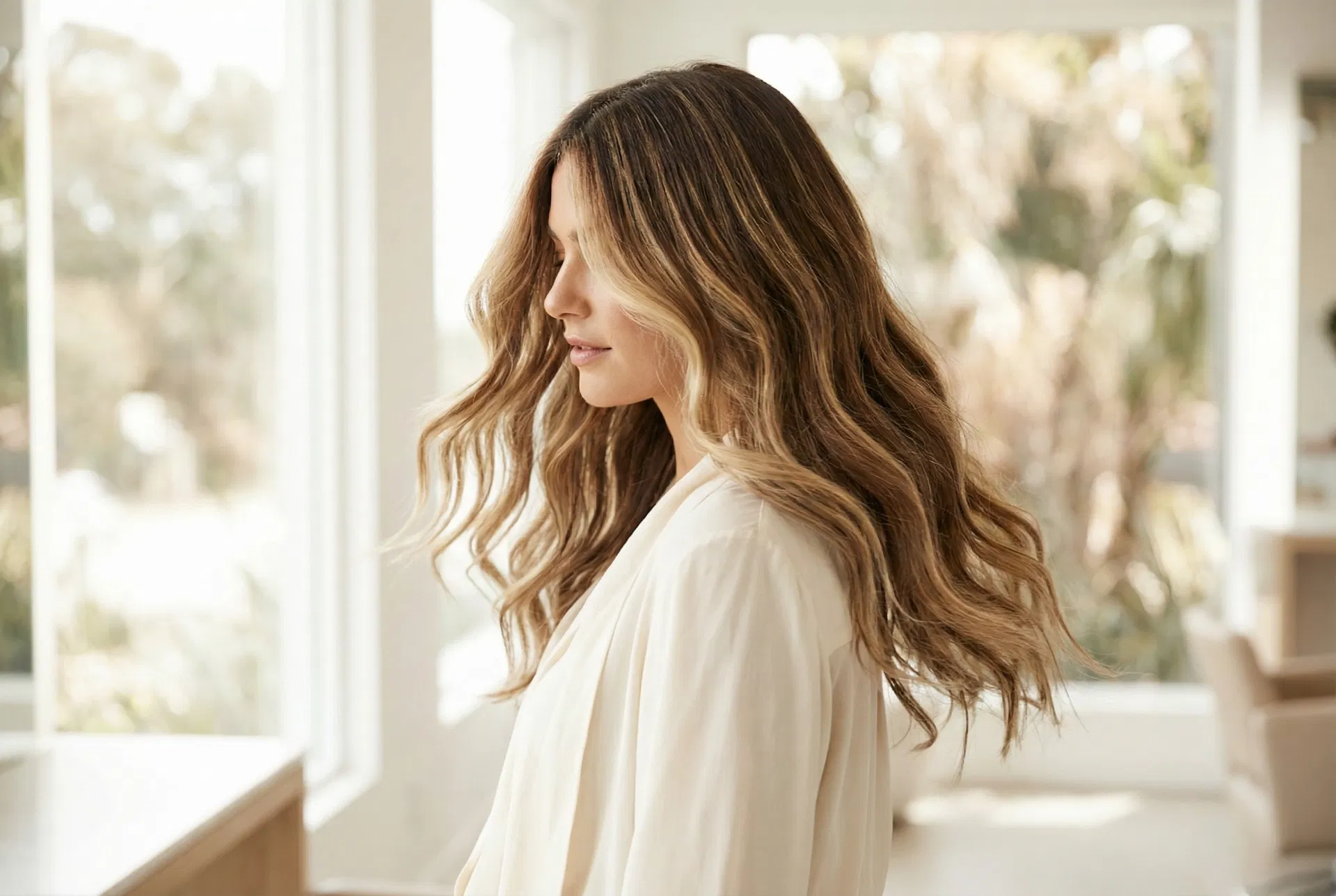
Your underlying skin undertone remains constant, but factors like hair colour changes can shift which colours within your seasonal palette are most harmonious. For instance, as hair greys, you might gravitate towards softer, more muted shades within your existing palette.
2. What if I like colours that aren't in my palette?
Personal style is about self-expression. If you love a colour outside your palette, wear it away from your face. A handbag, shoes, or a skirt in that colour can work well, while keeping the shades closest to your face within your flattering seasonal palette to ensure your complexion is illuminated.
3. How does lighting affect how colours look on me?
Lighting significantly impacts colour perception. Natural daylight offers the truest representation. Fluorescent light can cast a cool, blueish tone, while incandescent light is warmer. Always assess colours in natural light before purchasing to ensure they are as flattering as possible.
4. Are there any universally flattering colours?
Some colours, like teal, aubergine, and a true, balanced red, have a near-universal appeal due to their balanced undertones. When in doubt, these shades are often a safe and elegant choice for most people.
5. How can I start incorporating my new colour palette without buying a whole new wardrobe?
Start with small, impactful additions like a scarf, jewellery, or lipstick in your key colours. Focus on acquiring tops and jackets in your palette first, as they are worn closest to your face. Gradually replace older items to build a cohesive wardrobe over time without a large initial investment.